Introduction
Radar charts, also known as spider diagrams or star diagrams, offer a distinctive method of visualizing multivariate data. Unlike traditional Cartesian charts, which arrange the axes linearly, radar charts place the axes radially around a central point. This circular arrangement makes it easy to compare multiple quantitative variables simultaneously across different categories or dimensions, making radar charts very useful for revealing patterns and relationships within complex data sets.
General description
- Understand the fundamental concept and structure of radar charts.
- Gain proficiency in creating radar charts using Plotly in Python.
- Learn advanced customization techniques to improve radar chart visualizations.
- Develop skills to interpret radar charts effectively for comparative analysis.
- Explore the application of radar charts in various contexts, such as performance evaluation and product comparison.
Using Plotly for Radar Charts
Plotly Express provides a simple interface for creating radar charts in Python. It leverages the `px.line_polar` function to plot data points around circular axes, making customization and interactivity easy.
import plotly.express as px
import pandas as pd
# Example data
df = pd.DataFrame(dict(
   r=(3, 4, 2, 5, 4),
   theta=('Category 1', 'Category 2', 'Category 3', 'Category 4', 'Category 5')
))
# Creating a radar chart with Plotly Express
fig = px.line_polar(df, r="r", theta="theta", line_close=True)
fig.update_traces(fill="toself")  # Fill area inside lines
fig.show()
Improved radar charts
To add depth to radar charts, Plotly allows customization, such as filled areas (`fill='toself'`) to highlight regions enclosed between data points. This feature helps with visual clarity and emphasizes the relative strengths or values between different variables.
Also Read: A Complete Guide on Data Visualization in Python
Advanced radar charts with multiple traces
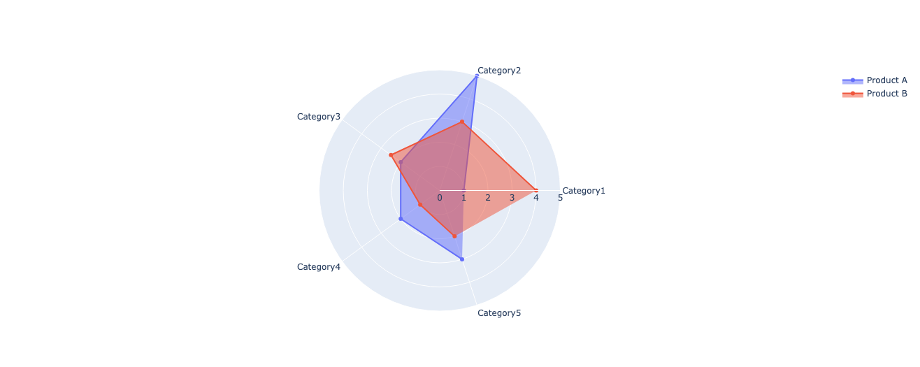
For comparative analysis, Plotly's `go.Scatterpolar` function allows the creation of radar plots with multiple traces. Each trace represents a different data set or category, allowing side-by-side comparisons of variables such as cost, stability, and integration between different products or scenarios.
import plotly.graph_objects as go
categories = ('Category1', 'Category2', 'Category3',
             'Category4', 'Category5')
fig = go.Figure()
# Adding traces for different products
fig.add_trace(go.Scatterpolar(
   r=(1, 5, 2, 2, 3),
   theta=categories,
   fill="toself",
   name="Product A"
))

fig.add_trace(go.Scatterpolar(
   r=(4, 3, 2.5, 1, 2),
   theta=categories,
   fill="toself",
   name="Product B"
))
fig.update_layout(
   polar=dict(
       radialaxis=dict(
           visible=True,
           range=(0, 5)  # Adjust range based on data
       )
   ),
   showlegend=True
)

fig.show()
Conclusion
Radar charts offer a fundamental tool for visualizing complex data in multiple variables. They are great for comparing product attributes, evaluating performance metrics, and analyzing survey feedback across multiple dimensions. They provide a structured framework that allows the comparison of several dimensions simultaneously. Whether you're examining product features, evaluating performance metrics, or analyzing survey responses, radar charts offer a concise way to represent complex information.
Master Python for data science with our Introduction to Python Program!
Frequent questions
A. Radar charts are primarily used to display multivariate data, illustrating relationships and variations between several variables in a pie chart. They are effective in comparing the relative strengths or characteristics of different entities or categories.
A. Radar charts are excellent when you need to compare several variables simultaneously and highlight patterns or trends in these variables. They are particularly useful in fields such as performance evaluation, market analysis, and product feature comparison.
A. Although radar charts allow you to view multiple variables, dealing with large data sets with numerous categories or variables can clutter the chart and reduce readability. It is essential to prioritize clarity and avoid overloading the chart with excessive information.
A. Python libraries such as Plotly offer extensive customization options for radar charts. You can adjust line styles, colors, axis labels, and ranges to tailor the visualization to specific data requirements. Plotly's interactivity also allows for dynamic exploration of data points within radar charts.
 NEWSLETTER


