Introduction
Pie charts, a widely used visualization tool, represent proportions of data in a circular format. Each sector corresponds to a category, which facilitates quick comparisons. Here, we discuss creating pie charts using Matplotlib.
Importance of Pie Charts in Data Visualization
Pie charts play a crucial role in data visualization for several reasons. First, they provide a visual representation of proportions or percentages, allowing viewers to quickly understand the distribution of the data. This makes it easy to identify patterns, trends, or disparities in the data.
Additionally, pie charts are useful for highlighting the relative importance of different categories. By comparing portion sizes, viewers can easily determine which categories are larger or smaller than each other. This can be especially useful when presenting data in a concise and visually appealing way.
Additionally, pie charts are effective at conveying information to a wide range of audiences. They are intuitive and easy to understand, even for people without a strong background in data analysis. This makes pie charts a valuable tool for communicating complex information in a clear and accessible way.
Also Read: 12 Types of Data Charts for Visualization from Concept to Code
Getting started with Matplotlib
Installing Matplotlib
Before you can start using Matplotlib, you must install it on your system. Installing Matplotlib is a simple process. You can use the pip package manager to install it by running the following command in your terminal:
Code:
!pip install matplotlibMake sure you have Python and pip installed on your system before running this command. Once the installation is complete, you can verify it by importing Matplotlib in your Python script without any errors.
Importing Matplotlib
To use Matplotlib in your Python script, you must first import it. You can import the pyplot module from Matplotlib, which provides a simple interface for creating and customizing plots. Here is an example of how to import Matplotlib:
Code:
import matplotlib.pyplot as pltBy convention, Matplotlib is usually imported as “plt” for brevity. This allows you to use shorter function names when creating graphs.
Read also: Matplotlib | Matplotlib for data visualization and exploration
Create a basic pie chart
Understand the data
Before we dive into creating a pie chart with Matplotlib, let's first understand the data we will be working with. A pie chart is a circular statistical graph that is divided into portions to represent different categories or proportions of a whole. Each sector of the pie chart represents a specific category and the size of the sector corresponds to the proportion of that category in the total.
In our example, we will create a pie chart to visualize the sales distribution of different products in a store. We will use a simple data frame with two columns: “Product” and “Sales”. The “Product” column will contain the product names and the “Sales” column will contain the corresponding sales figures.
Draw a simple pie chart
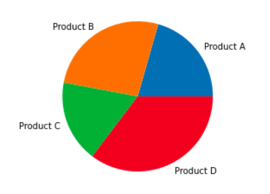
To plot a simple pie chart using Matplotlib, we need to import the necessary libraries and create a data frame with the data we want to visualize. We can then use the `plt.pie()` function to create the pie chart.
Below is an example code snippet that demonstrates how to create a basic pie chart:
Code:
import matplotlib.pyplot as plt

# Create a dataframe with the data

data = {'Product': ('Product A', 'Product B', 'Product C', 'Product D'),

        'Sales': (350, 450, 300, 600)}

df = pd.DataFrame(data)

# Plot the pie chart

plt.pie(df('Sales'), labels=df('Product'))

plt.show()
Production:
Customizing Pie Chart Colors
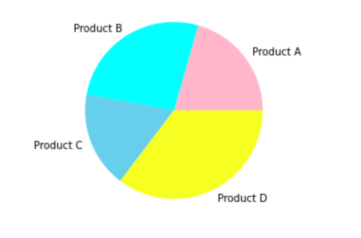
To customize the colors of the slices in the pie chart, we can pass a list of colors to the `colors` parameter of the `plt.pie()` function. Each color in the list corresponds to a portion of the pie chart.
Below is an example code snippet that demonstrates how to customize the colors of a pie chart:
Code:
import matplotlib.pyplot as plt

# Create a dataframe with the data

data = {'Product': ('Product A', 'Product B', 'Product C', 'Product D'),

        'Sales': (350, 450, 300, 600)}

df = pd.DataFrame(data)

# Define custom colors

colors = ('Pink', 'cyan', 'skyblue', 'yellow')

# Plot the pie chart with custom colors

plt.pie(df('Sales'), labels=df('Product'), colors=colors)

plt.show()
Production:
Add tags and percentages
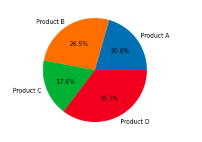
To add labels and percentages to the pie chart slices, we can use the `autopct` parameter of the `plt.pie()` function. The `autopct` parameter accepts a format string that specifies how percentages should be displayed.
Below is an example code snippet that demonstrates how to add labels and percentages to a pie chart:
Code:
import matplotlib.pyplot as plt

# Create a dataframe with the data

data = {'Product': ('Product A', 'Product B', 'Product C', 'Product D'),

        'Sales': (350, 450, 300, 600)}

df = pd.DataFrame(data)

# Plot the pie chart with labels and percentages

plt.pie(df('Sales'), labels=df('Product'), autopct="%1.1f%%")

plt.show()
Production:
Explosive slices
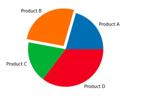
To emphasize a particular portion in the pie chart, we can “explode” it using the `explode` parameter of the `plt.pie()` function. The `explode` parameter accepts a list of values that specifies the extent to which each segment should be exploited.
Below is an example code snippet demonstrating how to explode a slice on a pie chart:
Code:
import matplotlib.pyplot as plt

# Create a dataframe with the data

data = {'Product': ('Product A', 'Product B', 'Product C', 'Product D'),

        'Sales': (350, 450, 300, 600)}

df = pd.DataFrame(data)

# Explode the second slice

explode = (0, 0.1, 0, 0)

# Plot the pie chart with an exploded slice

plt.pie(df('Sales'), labels=df('Product'), explode=explode)

plt.show()
Production:
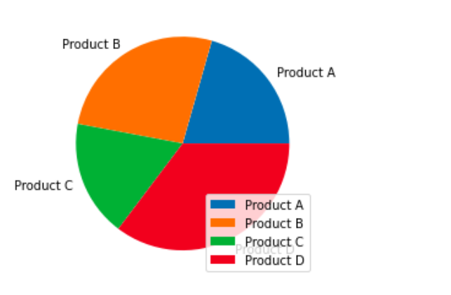
Add a legend
To add a legend to the pie chart, we can use the `plt.legend()` function. The legend provides a visual representation of the labels in the pie chart.
Here is an example code snippet that demonstrates how to add a legend to a pie chart:
Code:
import matplotlib.pyplot as plt

# Create a dataframe with the data

data = {'Product': ('Product A', 'Product B', 'Product C', 'Product D'),

        'Sales': (350, 450, 300, 600)}

df = pd.DataFrame(data)

# Plot the pie chart with a legend

plt.pie(df('Sales'), labels=df('Product'))

plt.legend()

plt.show()
Production:
Save and display the chart
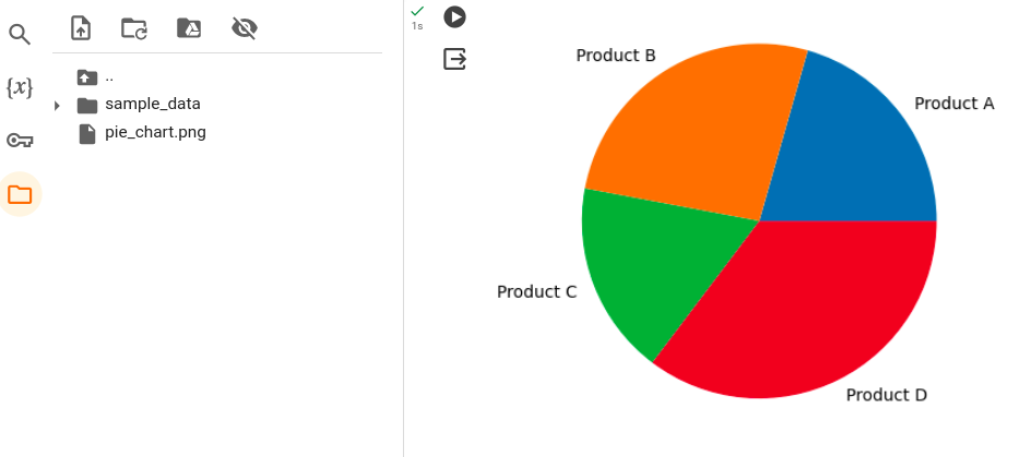
To save the pie chart as an image file, we can use the `plt.savefig()` function. The `plt.savefig()` function accepts a file name and the desired file format as parameters.
Below is an example code snippet that demonstrates how to save a pie chart as an image file:
Code:
import matplotlib.pyplot as plt

# Create a dataframe with the data

data = {'Product': ('Product A', 'Product B', 'Product C', 'Product D'),

        'Sales': (350, 450, 300, 600)}

df = pd.DataFrame(data)

# Plot the pie chart

plt.pie(df('Sales'), labels=df('Product'))

# Save the pie chart as an image file

plt.savefig('pie_chart.png')

plt.show()
Production:
Troubleshooting and tips
Handling missing or invalid data
When creating a pie chart with Matplotlib, it is important to properly handle missing or invalid data. If your data set contains missing values or invalid entries, it can affect the accuracy and reliability of your pie chart.
To handle missing or invalid data, you can use the pandas library in Python to create a DataFrame and clean the data before plotting the pie chart. You can remove any rows or columns with missing values using the dropna() function. Additionally, you can replace invalid inputs with appropriate values using the fillna() function.
Below is an example of how you can handle missing or invalid data:
Code:
import pandas as pd

import matplotlib.pyplot as plt

# Create a DataFrame with missing or invalid data

data = {'Category': ('A', 'B', 'C', 'D'),

        'Value': (10, None, 20, 'Invalid')}

df = pd.DataFrame(data)

# Replace invalid entries with appropriate values

df('Value') = pd.to_numeric(df('Value'), errors="coerce")

# Drop rows with missing or invalid numeric values

df = df.dropna()

# Plot the pie chart

plt.pie(df('Value'), labels=df('Category'))

plt.show()
Production:
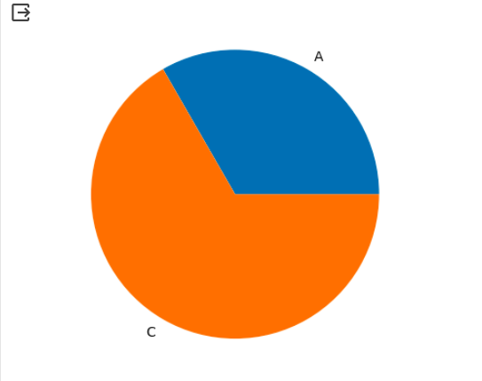
By handling missing or invalid data before creating the pie chart, you can ensure that your chart accurately represents the available data.
How to deal with overlapping tags
Sometimes when creating a pie chart with a large number of categories, the labels can overlap and become unreadable. This can make it difficult for viewers to interpret the graph effectively.
To deal with overlapping labels, you can adjust the size and position of the labels using the labeldistance and autopct parameters in the plt.pie() function. The labeldistance parameter controls the distance of the labels from the center of the pie chart, while the autopct parameter specifies the format of the percentage values displayed on the chart.
Below is an example of how you can deal with overlapping labels:
Code:
import matplotlib.pyplot as plt

# Create a pie chart with overlapping labels

labels = ('Category 1', 'Category 2', 'Category 3', 'Category 4', 'Category 5')

sizes = (20, 30, 10, 15, 25)

# Adjust the size and position of the labels

plt.pie(sizes, labels=labels, labeldistance=1.1, autopct="%1.1f%%")

plt.show()
Production:
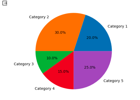
By adjusting the labeldistance and autopct parameters, you can ensure that the labels in your pie chart are clear and legible.
Avoid misleading pie charts
Pie charts can sometimes be misleading if not used properly. It is important to avoid using pie charts when the data does not represent parts of a whole or when there are too many categories, as it can make the chart difficult to interpret.
To avoid misleading pie charts, consider using other types of charts, such as bar charts or line charts, depending on the nature of your data. These graphs can provide a clearer representation of the data and make it easier for viewers to understand the information being presented.
Also, make sure that the sizes of the circular slices accurately represent the proportions of the data. You can achieve this by sorting the data in descending order before creating the pie chart.
Improved accessibility and usability
When creating pie charts, it is important to improve accessibility and usability for all viewers. Consider the following tips:
- Use high-contrast colors to ensure the graph is readable for people with visual impairments.
- Provide a legend or labels to clearly identify each category in the chart.
- Avoid using shadows or 3D effects, as they can make the graph difficult to interpret.
- Use appropriate font sizes for labels to ensure readability.
- Test the chart on different devices and screen sizes to ensure it is responsive and accessible.
By following these tips, you can improve the accessibility and usability of your pie charts and ensure that they effectively communicate the desired information.
Conclusion
In conclusion, creating and customizing pie charts with Matplotlib can be a powerful tool for visualizing data. By following the guidelines and tips provided in this guide, you will be able to create informative and visually appealing pie charts that communicate your data effectively.
Remember to properly handle missing or invalid data, deal with overlapping labels, avoid misleading pie charts, and improve accessibility and usability. With these considerations in mind, you can create pie charts that effectively convey your data insights to your audience.
So go ahead, explore the various customization options available in Matplotlib and start creating your own visually stunning pie charts!


