
Image by the author | DALLE-3 and Canva
Missing values in real-world datasets are a common problem. This can occur due to various reasons such as failed observations, data transmission errors, sensor malfunctions, etc. We cannot simply ignore them as they can bias the results of our models. We need to remove them from our analysis or handle them to make our dataset complete. Removing these values will lead to information loss, which is not desirable. So scientists came up with various ways to handle these missing values such as imputation and interpolation. People often confuse these two techniques; imputation is a more common term among beginners. Before we proceed further, let me draw a clear boundary between these two techniques.
Imputation basically involves filling in missing values using statistical measures such as mean, median, or mode. It is quite simple, but it does not take into account the trend of the dataset. However, interpolation estimates the value of missing values based on surrounding trends and patterns. This approach is more feasible to use when the missing values are not too spread out.
Now that we know the difference between these techniques, let’s discuss some of the interpolation methods available in Pandas. Then, I’ll show you an example and give you some tips to help you choose the right interpolation technique.
Types of Interpolation Methods in Pandas
Pandas offers several interpolation methods ('linear', 'time', 'index', 'values', 'padding', 'nearest', 'zero', 'slinear', 'quadratic', 'cubic', 'barycentric', 'krogh', 'polynomial', 'spline', 'piecewise polynomial', 'of_derivatives', 'pchip', 'akima', 'cubicspline') which you can access using the interpolate() Function. The syntax for this method is as follows:
DataFrame.interpolate(method='linear', **kwargs, axis=0, limit=None, inplace=False, limit_direction=None, limit_area=None, downcast=_NoDefault.no_default, **kwargs)I know there are many methods out there and I don't want to overwhelm you. So, let's look at some of the ones that are commonly used:
- Linear interpolation: This is the default method, which is fast and computationally simple. It connects the known data points by drawing a straight line, which is used to estimate missing values.
- Time interpolation: Time-based interpolation is useful when data is not uniformly distributed in terms of position, but is linearly distributed over time. For this, the index must be a date-time index and it fills in missing values by taking into account the time intervals between data points.
- Index interpolation: This is similar to time interpolation, where the index value is used to calculate missing values. However, here it does not need to be a datetime index, but should convey meaningful information such as temperature, distance, etc.
- Forward and reverse filling method: It refers to copying the already existing value to fill the missing value. If the propagation direction is forward, the last valid observation will be filled forward. If it is backward, the next valid observation will be used.
- Closest interpolation: As the name suggests, it uses local variations in the data to fill in the values. The closest value to the missing value will be used to fill it in.
- Polynomial interpolation: We know that real-world data sets are mostly non-linear. So this function fits a polynomial function to the data points to estimate the missing value. You will also need to specify the order for this (e.g. order = 2 for quadratic).
- Spline interpolation: Don't be intimidated by the complex name. A spline curve is formed by using piecewise polynomial functions to connect the data points, resulting in a final smooth curve. You'll notice that the interpolation function also has
piecewise_polynomialas a stand-alone method. The difference between the two is that the latter does not guarantee continuity of derivatives at the limits, meaning that it can accommodate more abrupt changes.
Enough of the theory; let's use the Airline Passengers dataset, which contains monthly passenger data from 1949 to 1960, to see how interpolation works.
Code Implementation: Airline Passenger Dataset
We will introduce some missing values into the airline passenger dataset and then interpolate them using one of the above techniques.
Step 1: Perform imports and load datasets
Import the core libraries as mentioned below and load the CSV file of this dataset into a DataFrame using the pd.read_csv function.
import pandas as pd
import numpy as np
import matplotlib.pyplot as plt

# Load the dataset
url = "https://raw.githubusercontent.com/jbrownlee/Datasets/master/airline-passengers.csv"
df = pd.read_csv(url, index_col="Month", parse_dates=('Month'))
parse_dates will convert the 'Month' column to a datetime object, and index_col sets it as the index of the DataFrame.
Step 2: Enter missing values
Now, we will randomly select 15 different instances and mark the 'Passengers' column as np.nanrepresenting missing values.
# Introduce missing values
np.random.seed(0)
missing_idx = np.random.choice(df.index, size=15, replace=False)
df.loc(missing_idx, 'Passengers') = np.nan
Step 3: Plot data with missing values
We will use Matplotlib to visualize what our data looks like after introducing 15 missing values.
# Plot the data with missing values
plt.figure(figsize=(10,6))
plt.plot(df.index, df('Passengers'), label="Original Data", linestyle="-", marker="o")
plt.legend()
plt.title('Airline Passengers with Missing Values')
plt.xlabel('Month')
plt.ylabel('Passengers')
plt.show()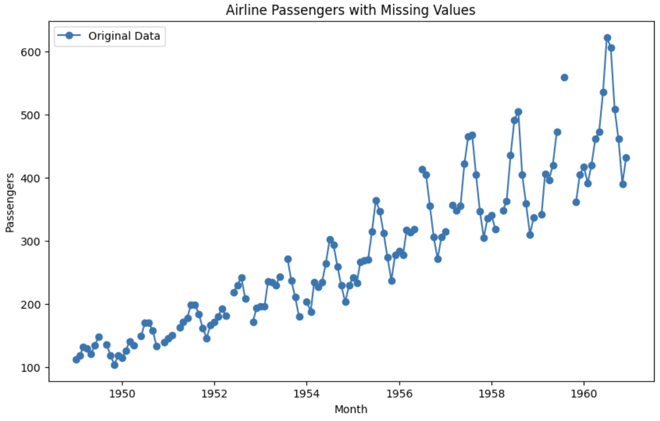

Graph of the original dataset
You can see that the graph is split in two, showing the absence of values at those locations.
Step 4: Using interpolation
Although I will share some tips later to help you choose the right interpolation technique, let’s focus on this dataset. We know that this is time series data, but since the trend doesn’t seem to be linear, simple time-based interpolation that follows a linear trend doesn’t fit well here. We can observe some patterns and oscillations along with linear trends only within a small neighborhood. Considering these factors, spline interpolation will work well here. So, let’s apply that and check how the visualization turns out after interpolating the missing values.
# Use spline interpolation to fill in missing values
df_interpolated = df.interpolate(method='spline', order=3)

# Plot the interpolated data
plt.figure(figsize=(10,6))
plt.plot(df_interpolated.index, df_interpolated('Passengers'), label="Spline Interpolation")
plt.plot(df.index, df('Passengers'), label="Original Data", alpha=0.5)
plt.scatter(missing_idx, df_interpolated.loc(missing_idx, 'Passengers'), label="Interpolated Values", color="green")
plt.legend()
plt.title('Airline Passengers with Spline Interpolation')
plt.xlabel('Month')
plt.ylabel('Passengers')
plt.show()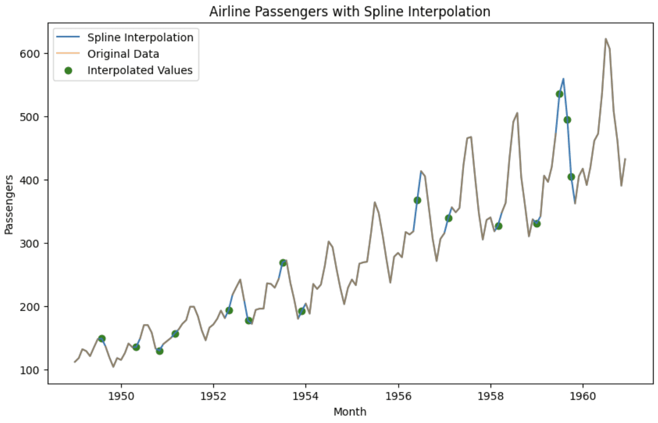

Graph after interpolation
In the chart we can see that the interpolated values complete the data points and also preserve the pattern. It can now be used for further analysis or forecasting.
Tips for choosing the interpolation method
This additional part of the article focuses on some tips:
- Visualize your data to understand its distribution and pattern. If the data is uniformly distributed or missing values are randomly distributed, simple interpolation techniques will work well.
- If you observe trends or seasonality in your time series data, it is best to use spline or polynomial interpolation to preserve these trends while filling in missing values, as demonstrated in the example above.
- Higher degree polynomials can be fit more loosely, but are prone to overfitting. Keep the degree low to avoid unreasonable shapes.
- For unevenly spaced values, use index-based methods like index and time to fill in the gaps without distorting the scale. You can also use backfill or forwardfill here.
- If your values don't change frequently or follow an up and down pattern, using the nearest valid value also works well.
- Test different methods on a sample of data and evaluate how well the interpolated values fit the actual data points.
If you want to explore other parameters of the `dataframe.interpolate` method, the Pandas documentation is the best place to check it out: Pandas Documentation.
Kanwal Mehreen Kanwal is a machine learning engineer and technical writer with a deep passion for data science and the intersection of ai with medicine. She is the co-author of the eBook “Maximizing Productivity with ChatGPT.” As a Google Generation Scholar 2022 for APAC, she champions diversity and academic excellence. She is also recognized as a Teradata Diversity in tech Scholar, Mitacs Globalink Research Scholar, and Harvard WeCode Scholar. Kanwal is an ardent advocate for change and founded FEMCodes to empower women in STEM fields.


