Introduction
In the world of data analysis and statistics, visualizations play a crucial role in understanding underlying patterns and outliers within data sets. One such powerful visualization tool is the boxplot, a box-and-whisker plot. Summarizes one or more data sets based on the summary of five numbers: minimum, first quartile (Q1), median, third quartile (Q3), and maximum. In this article, we will discuss what boxplots are, their components, how to create them in Python using matplotlib, and how to interpret them with a real-world data set example.
Explanation of the components of a box plot
- Median (Q2/50th percentile): The average value of the data set.
- Quartiles: The data set is divided into four equal parts. The first quartile (Q1) is the 25th percentile, the second quartile (Q2) is the 50th percentile, and the third quartile (Q3) is the 75th percentile.
- Whiskers: These lines extend from the quartiles to the rest of the data set, excluding outliers, and typically represent 1.5 times the interquartile range (IQR) above and below the first and third quartiles.
- Atypical values: Data points outside the whiskers are considered outliers and are typically represented as individual points.
For further clarification, you can see the image attached below:
Data types suitable for displaying boxplots
Box plots are ideal for comparing distributions across multiple groups or data sets. They are useful for visualizing data dispersion and skewness and identifying outliers. Box plots can be used with continuous and discrete data, making them versatile for various applications.
Importing required libraries
Before starting plotting, we need to import the necessary libraries. Matplotlib is the main library we will use to plot boxplots. Additionally, pandas will be used to load and manipulate data.
Loading data using Pandas
Loading data is easy with pandas. Whether your data is in a CSV file, Excel, or another format, pandas can handle it. Here's how to load data from a CSV file:
Plot using Matplotlib
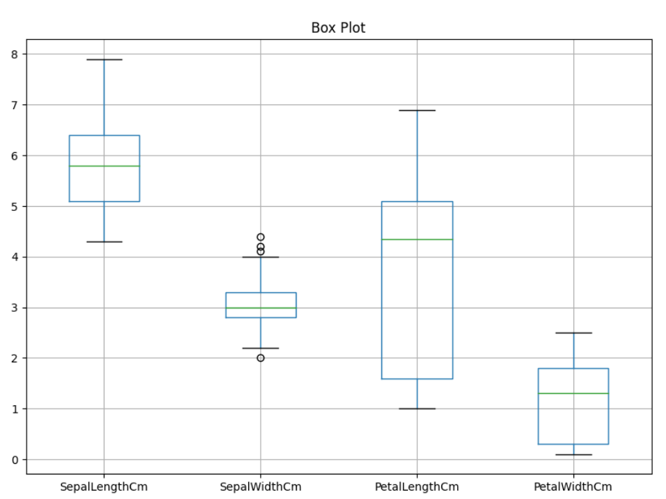
Basic Matplotlib syntax for plotting boxplots
Matplotlib makes it easy to plot boxplots.

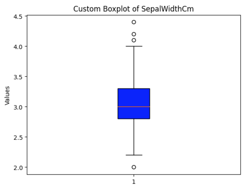
Customizing the boxplot (colors, labels)
You can customize your boxplot in several ways to make it more informative:

Read more: How to create a Box-Plot chart in QlikView?
Analysis and interpretation of box plots
When analyzing a boxplot, focus on the following:
- The median indicates the middle value of the data set.
- The dispersion of the quartiles (T3-T1) shows the variability of the data.
- Whiskers provide information about the scope of the data.
- Outliers can indicate variability or errors in the data.
Conclusion
Box plots are invaluable in exploratory data analysis and provide a compact representation of data distributions. Understanding and using them allows you to quickly identify central tendencies, variability, and potential outliers in your data set. With the practical example provided, you can now apply boxplot visualizations.


