
Editor's Image | Midjourney
Have you ever wondered how to transform data into clear, meaningful insights? Data visualizations do just that: they turn complex information into simple visualizations that everyone can quickly understand. In this article, we'll explore five tips to help you create effective data visualizations.
Our Top 5 Free Course Recommendations

 1. Google Cybersecurity Certificate: Get Fast Track to a Career in Cybersecurity

 2. Natural Language Processing in TensorFlow: Building NLP Systems

 3. Python for Everyone: Develop Programs to Collect, Clean, Analyze, and Visualize Data

 4. Google IT Support Professional Certification

 5. AWS Cloud Solutions Architect – Professional Certification
1. Know your audience
Understanding your audience is critical to effective data visualization. Tailor your visuals to meet their needs and expectations. Identify viewers by their background, roles, and interests. For example, investors focus on financial metrics, while managers prioritize operational efficiency. Adjust the level of detail based on your audience. Experts may need deep data analysis, while decision-makers prefer clear summaries for strategic decisions. Consider your audience’s preferred format. Some prefer interactive dashboards, others static infographics or detailed reports. For example, a marketing team may prefer interactive dashboards to track campaign performance metrics in real time. Meanwhile, a PR team may find static infographics useful for visually presenting media coverage. Make sure everyone can access the data. Consider factors such as language skills and visual impairments.
2. Choose the right visual element
Different types of visuals each have their advantages. It is important to select the right graphic for each purpose.
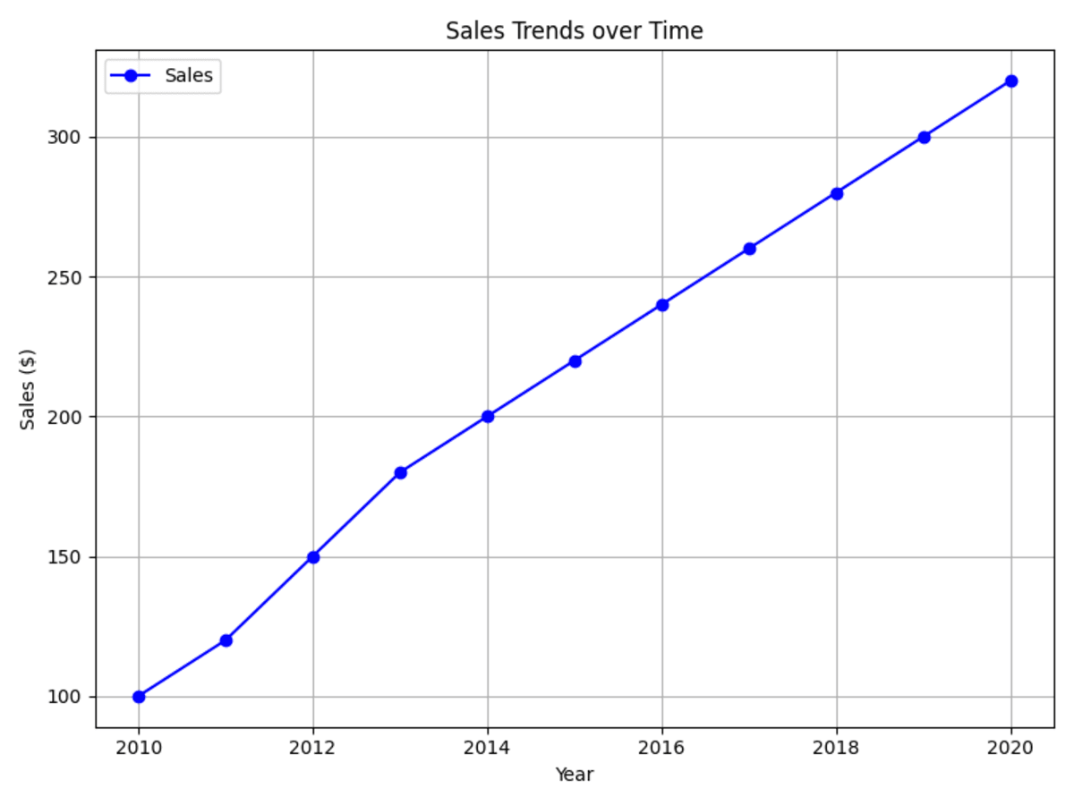
Use a line graph to show trends over time. In the example provided, a line graph is used to graphically represent sales trends over the years.

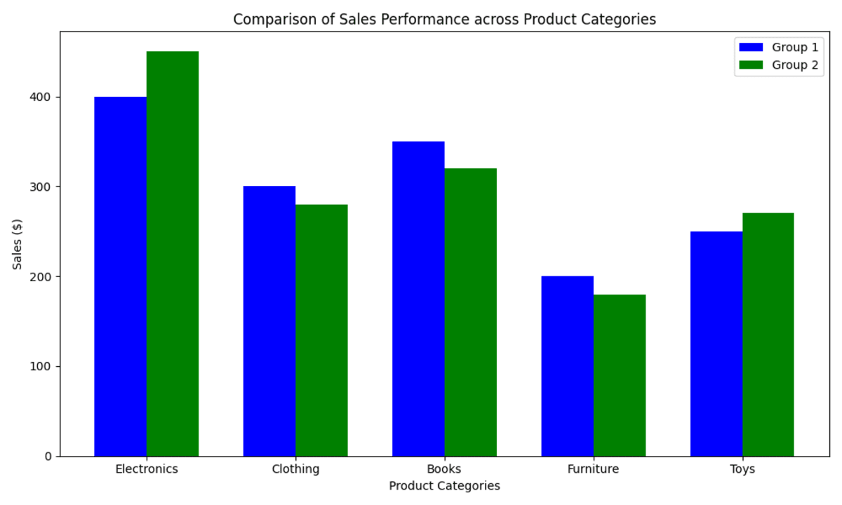
Opt for a bar chart when comparing categories across different groups. For example, a bar chart can compare sales performance across five different product categories.

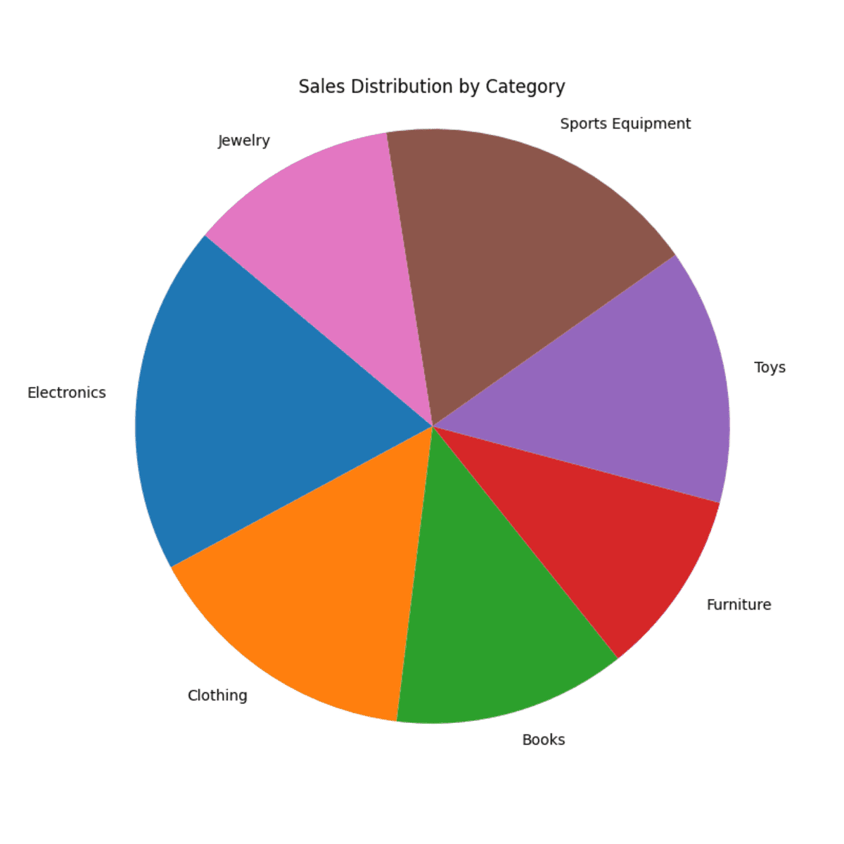
Avoid pie charts to get a clear representation of data. They are difficult to read and compare accurately. It is difficult to distinguish small differences between slices. If there are too many categories, the pie chart becomes cluttered. The pie chart below visualizes the sales proportions in different categories. There are many categories and small differences between sales in each category, making the pie chart difficult to interpret.

3. Avoid misleading visualizations
Misleading visualizations can distort the truth and lead to misinterpretation of data. Use accurate scales on charts to truthfully represent data. Avoid truncated axes or inconsistent scales that distort differences between data points. Label all elements of your visualization: axes, data points, and categories. Ambiguous or missing labels can confuse viewers. Use consistent units across data points and axes to avoid confusion. Three-dimensional effects can distort perception of data. Use 2-D representations unless the third dimension adds meaningful information. Be wary of shapes (such as circles or squares) that represent quantities. Make sure their size or area matches the numerical values they represent. Verify data accuracy before creating visuals. Errors in data collection or processing can lead to misleading representations.
4. Keep it simple
When creating data visualizations, simplicity is key to improving clarity and effectiveness. Clear, simple visuals help viewers grasp information quickly and accurately without unnecessary distractions or confusion. Use concise labels that clearly describe each element of your visualization. Avoid technical jargon that could confuse non-experts. Choose fonts that are easy to read. Make sure text is large enough to be read comfortably on screens or in print. Focus on the essential elements to convey your message. Use white space strategically to maintain visual balance and avoid overload. Make sure to use consistent color schemes that enhance the data rather than distract from it.
5. Tell a story
Storytelling begins by framing the narrative around the data itself. Identify the specific problem your data analysis is intended to address. Use graphs to illustrate patterns across variables. Interpret findings to uncover meaningful insights. Summarize the most important findings from your analysis.
Imagine a retail chain that analyzes customer purchasing behavior in its stores. They want to know which products are most popular and why customers prefer certain items. Graphs and charts show sales data for various product categories at various locations. They reveal trends in customer preferences and purchasing patterns over the past year. The results indicate the top-selling products and regional differences in customer preferences.
Ending up
In conclusion, use these tips to create clear and impactful data visualizations. Apply them now to improve understanding and make better decisions with your data.
Jayita Gulati She is a machine learning enthusiast and technical writer driven by her passion for building machine learning models. She holds a Masters in Computer Science from the University of Liverpool.
 NEWSLETTER


