Dashboards are the lifeblood of modern businesses, providing a clear, concise view of critical metrics. This article explores 20 diverse Power BI dashboard examples, showcasing how data can be transformed into actionable insights. From sales and marketing to HR and social media, these dashboards offer inspiration for your data visualization projects.
Importance of Dashboards
Dashboards are interactive visual tools that present data in a clear, digestible format. They pull data from various sources, like web traffic, sales, and social media, to help you:
- Spot trends: Identify patterns and shifts in data.
- Make informed decisions: Base decisions on data-driven insights.
- Track progress: Monitor performance against goals.
Dashboards are versatile and can be tailored to the needs of specific departments or roles. For example, a sales dashboard might focus on revenue and pipeline metrics, while an HR dashboard could track employee turnover and satisfaction.
The key to effective dashboards is simplicity and clarity. Prioritize relevant metrics, use clear visualizations, and ensure easy navigation. By leveraging dashboards, you can unlock the full potential of your data.
Essential Components for Building an Effective Dashboard
There are mainly three key components in creating a Dashboard: Data, Design and Interactivity.
- Data: Serves as the foundation of the dashboard. All insights are derived from raw data, which is processed, analyzed, and transformed into a usable format for decision-making.
- Design: Focuses on creating an intuitive and visually appealing layout. A well-designed dashboard should include clear, easy-to-understand charts, graphs, and a consistent color scheme to enhance readability and user experience.
- Interactivity: Key to unlocking deeper insights. Dashboards should allow users to interact with the data, using filters and slicers to explore various aspects of the data and discover trends and correlations not immediately visible in static reports.
Also Read: Top 20 Data Visualization Examples
Top Power BI Dashboard Examples to Inspire Your Design
Discover top Power BI dashboard examples that highlight exceptional design and functionality, offering valuable inspiration for creating your own impactful data visualizations.
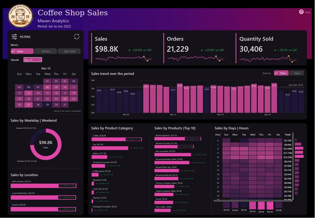
Sales Analytics Dashboard
- It tracks important metrics like sales, orders, and quantity sold over a set period.
- It features interactive filters and visualizations like bar charts, column charts, heatmaps, line charts and pie charts to explore trends, product performance, and sales distribution across different categories, days, and locations.
- It provides a clear view of performance, helping identify top products, peak sales times, and location trends. This supports better decision-making and operational improvements.
<a target="_blank" href="https://community.fabric.microsoft.com/t5/Themes-Gallery/Coffee-shop-Sales-Sales-Analytics/m-p/3568815″ target=”_blank” rel=”nofollow noopener”>Link to the Dashboard
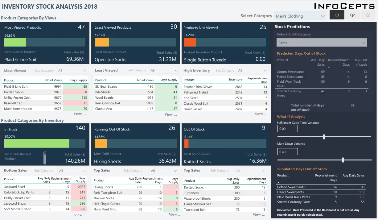
Inventory Analysis Dashboard
- It tracks key inventory metrics like most and least viewed products, in stock, running out of stock, and out of stock, along with top and bottom sales and days of supply.
- It includes interactive filters for category and quarter selection, along with features for “What If” scenarios to simulate changes in the fulfilment cycle and markdown variance.
- It helps optimize stock levels, predict restocking needs, and avoid overstock or stockouts. This ultimately improves supply chain efficiency and customer satisfaction.
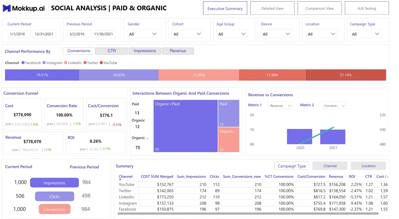
Social Media Analytics Dashboard
- It tracks critical metrics like cost of conversion, conversion rate, revenue, ROI and the ratio of cost to conversion over a period of time.
- It features dynamic visualizations including column charts, tree maps, and funnel charts along with multiple filters to display real-time performance data.
- It enables strategic decision-making by helping teams monitor performance and optimize marketing and social media strategies.
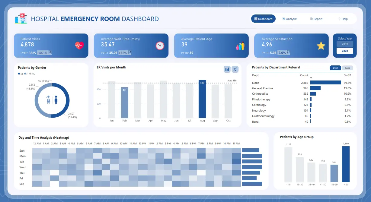
Healthcare Management Dashboard
- It monitors key performance indicators including total patient visits, average wait time, average patient age, and average satisfaction score for the hospital’s emergency room.
- It provides visual insights through pie charts, bar charts, column charts and heat maps, along with a filter to change the year.
- It supports the management in quickly assessing the age and satisfaction rate of people visiting the emergency room and helps them to make data-driven optimization decisions and strategies to improve their service to reduce the wait time and improve the satisfaction rate.
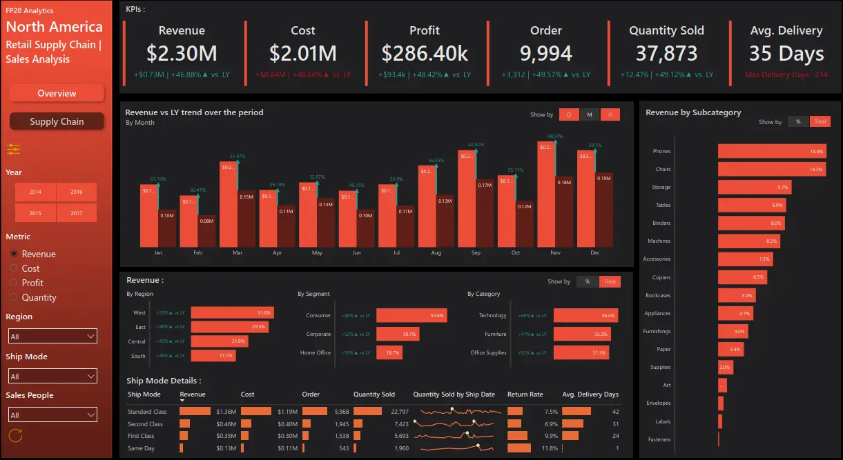
Retail Management Dashboard
- It highlights essential performance metrics such as total revenue, cost, profit, number of orders, quantity sold and average delivery time over a period of time.
- It also features interactive visual tools like bar charts, column charts, and line charts for real-time tracking.
- It facilitates the management team to make a good view of business performance and helps to make rapid, informed decision-making to enhance sales, profit and overall business strategies to maximise profit.
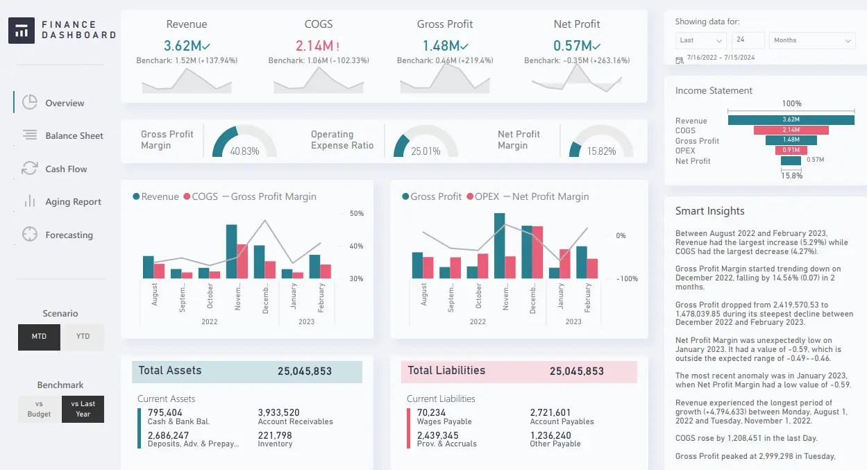
Financial Analytics Dashboard
- It tracks essential metrics like total revenue, cost of goods sold (COGS), gross profit, and net profit.
- It visualizes data through combined line and column charts, funnel charts, and gauge charts over a period of time, along with dynamic filters for better insights.
- It provides real-time insights for quick strategic adjustments and performance tracking along with key insights.
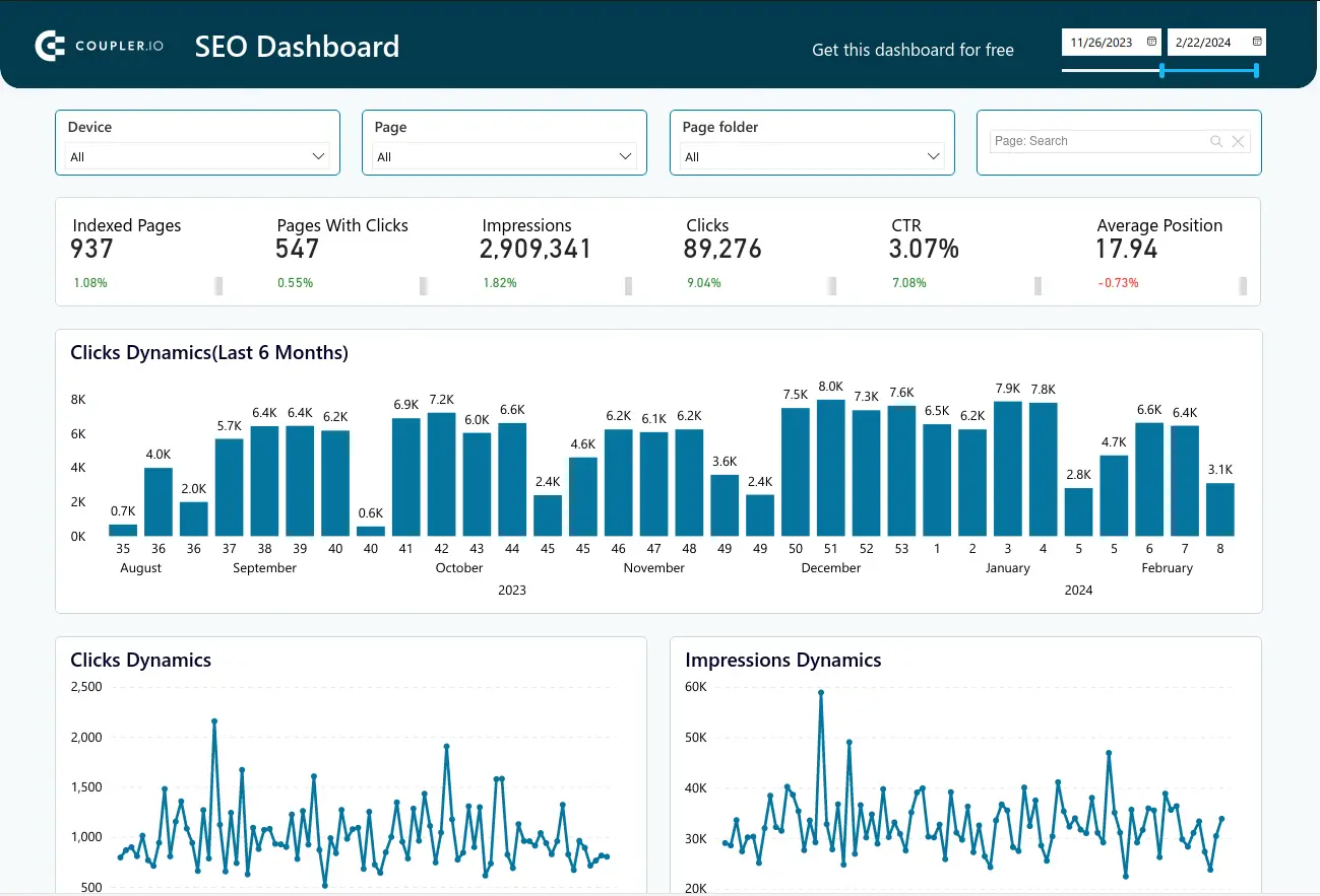
SEO Performance Dashboard
- The dashboard shows key metrics like indexed pages, pages with clicks, impressions, clicks, CTR, and average position, giving an overview of the webpage or website’s SEO performance.
- It includes visualizations like column charts and trend lines to track these metrics over time, with dynamic filters for deeper analysis.
- The dashboard is vital for the company as it enables stakeholders to monitor real-time performance, spot trends quickly, and make informed decisions to improve the SEO performance of their page, ultimately increasing traffic to their website.
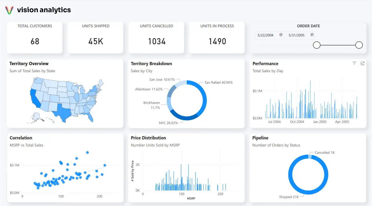
Executive Dashboard
- The dashboard displays key metrics like total customers, units shipped, units cancelled, and units in progress at executive level.
- It uses map charts, pie charts, and column charts and scatter charts to track overall performance of the business over a period of time.
- This dashboard is crucial for the executives of the company as it helps them to monitor and get an overview of the business performance and helps them to make data-driven decisions to improve sales, customer engagement, and operations.
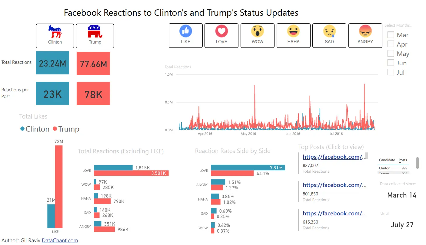
Sentiment Analysis Dashboard
- The dashboard shows metrics like total reactions and reactions per post on facebook.
- It includes visualizations such as line, bar, and column charts, with data segmented by reactions/sentiments for detailed insights.
- The dashboard is valuable for social media managers as it provides user’s views or sentiments related to a certain topic or post enabling teams to optimize their strategies and make informed decisions to boost better reactions and create a good buzz on social media.
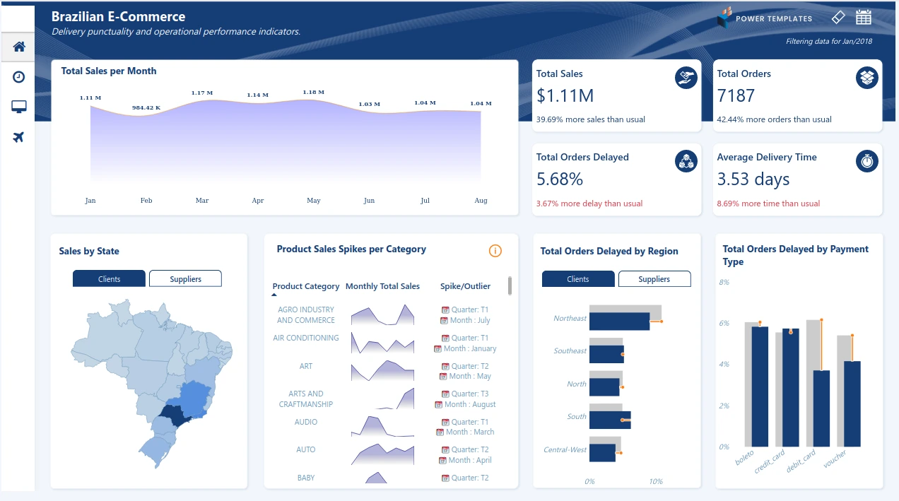
E-Commerce Store Dashboard
- The dashboard shows key metrics like total sales, orders, orders delayed, and average delayed time.
- It includes visualizations such as line charts, bar charts, column charts, line graphs, and map visualizations, with data segmented by state, product, region and payment type for deeper insights.
- The dashboard is essential for the company as it provides real-time performance tracking, of their e-commerce store helping teams identify issues quickly, allocate resources efficiently, and optimize strategies to improve sales and customer engagement and satisfaction.
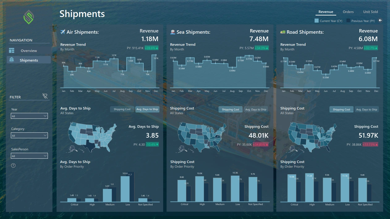
Shipping Industry BI Dashboard
- It provides metrics like revenue for different types of shipments, average days to ship the goods and shipping costs.
- It features visualizations like column charts and map visualizations with relevant filters and incremental and decremental trend changes.
- It helps the decision-makers with real-time insights about the shipment status and transforms complex data into actionable insights.
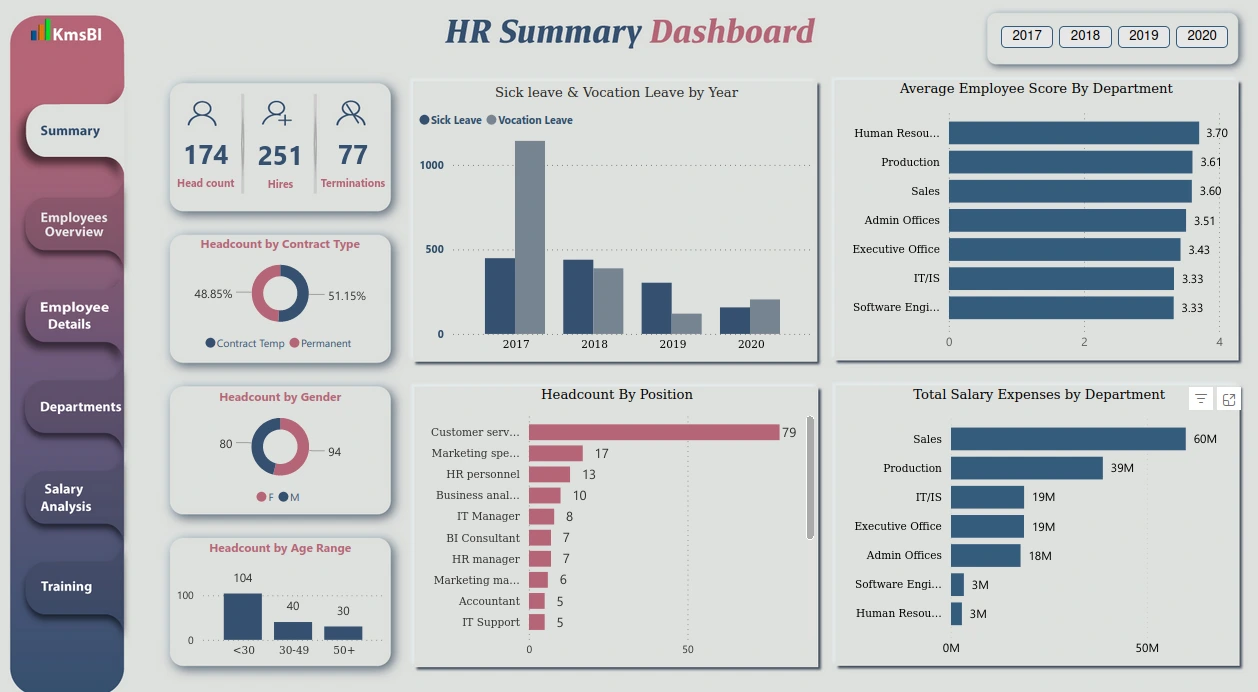
HR Analytics Dashboard
- It captures metrics like total headcount, hires, terminations, leaves per year, average employee score by the department and total salary expense by the department.
- It features visualizations like column charts, bar charts, and pie charts for detailed insights, along with a year filter.
- It is highly useful for HR heads as it provides a clear, data-driven overview of workforce metrics, enabling them to track headcounts, departmental performance, and salary expenses efficiently which supports strategic decisions in management and resource allocation.
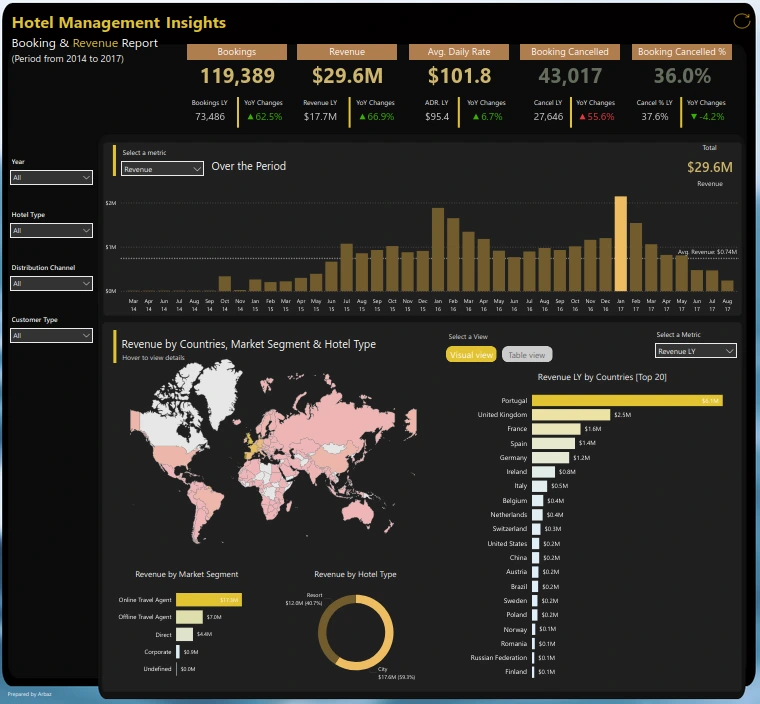
Hotel Management Dashboard
- It captures metrics like total bookings, revenue, average daily rate, and bookings cancelled over a period of time.
- It features visualisations like column charts, bar charts, and map visualizations, along with dynamic filters to get deeper insights.
- It helps the managers to look for key performance indicators like bookings, revenue etc. in real-time which allows them to make informed decisions on pricing, occupancy strategies and operational changes.
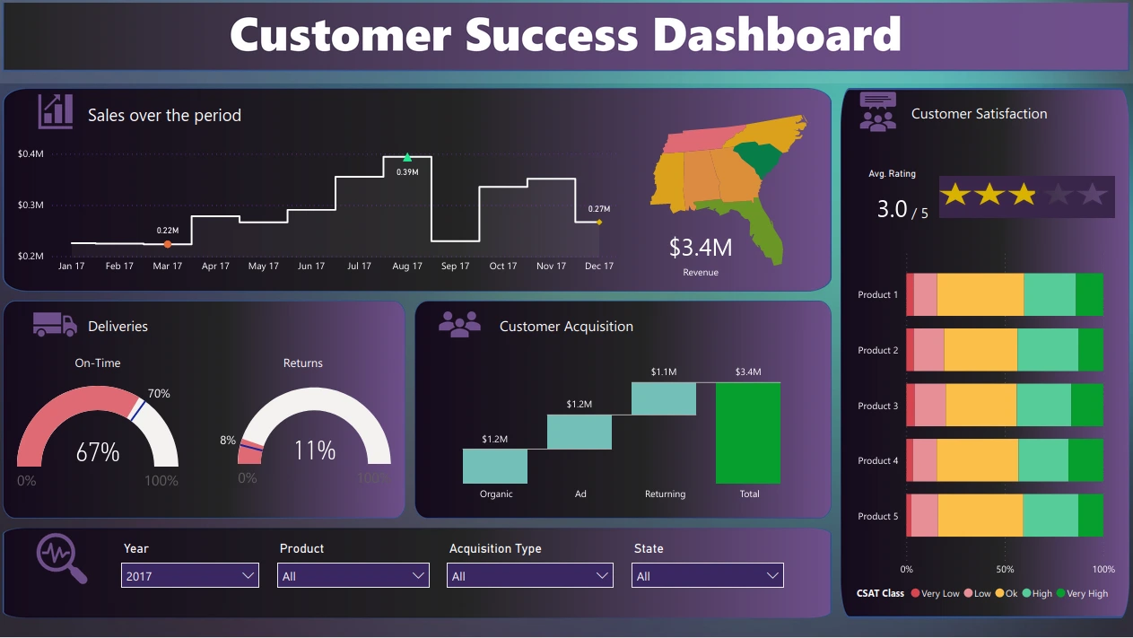
Customer Satisfaction Dashboard
- This dashboard shows information about sales over the period, revenue, deliveries, customer acquisition and ratings.
- It features visualizations like column charts, waterfall charts, gauge charts, 100% stacked bar charts and map visualization, along with multiple filters to get more analysis on the data.
- It helps businesses to track KPIs, which helps teams to identify trends, measure the satisfaction ratings, and make data-backed decisions to improve customer experience and improve the quality of their service.
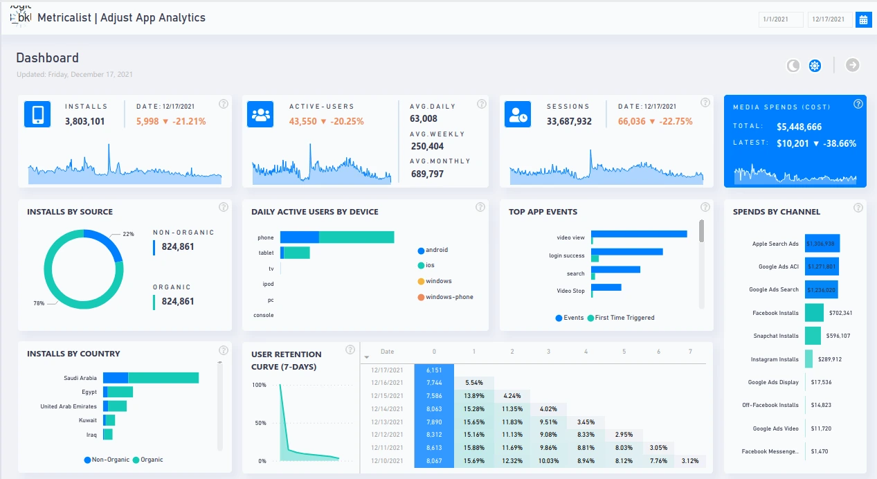
Mobile App Analytics Dashboard
- This dashboard features metrics like number of installs, active users, sessions, cost, and user retention.
- It includes interactive charts like line charts, bar charts, pie charts and tables which also includes values for comparison and see the changes over time.
- It enables business stakeholders to make data-driven decisions and optimize app performance, improve the user experience and give a boost to company growth.
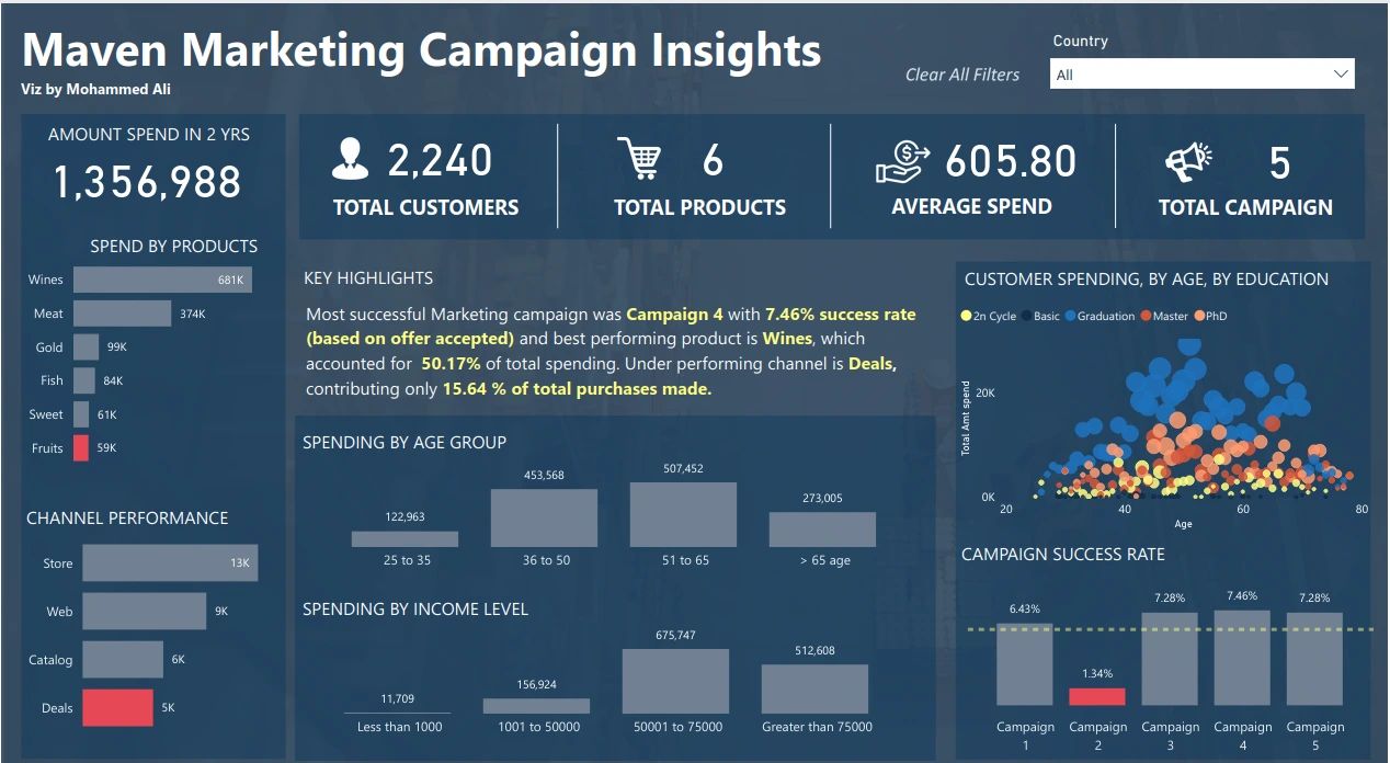
Marketing Performance Dashboard
- This dashboard presents metrics like total customers, products, average spend, total campaign.
- It uses visualizations like scatter plot, column chart, bar chart along with country level filter and key highlights for better understanding.
- It helps teams to optimize marketing strategies based on the metrics and make better decisions.
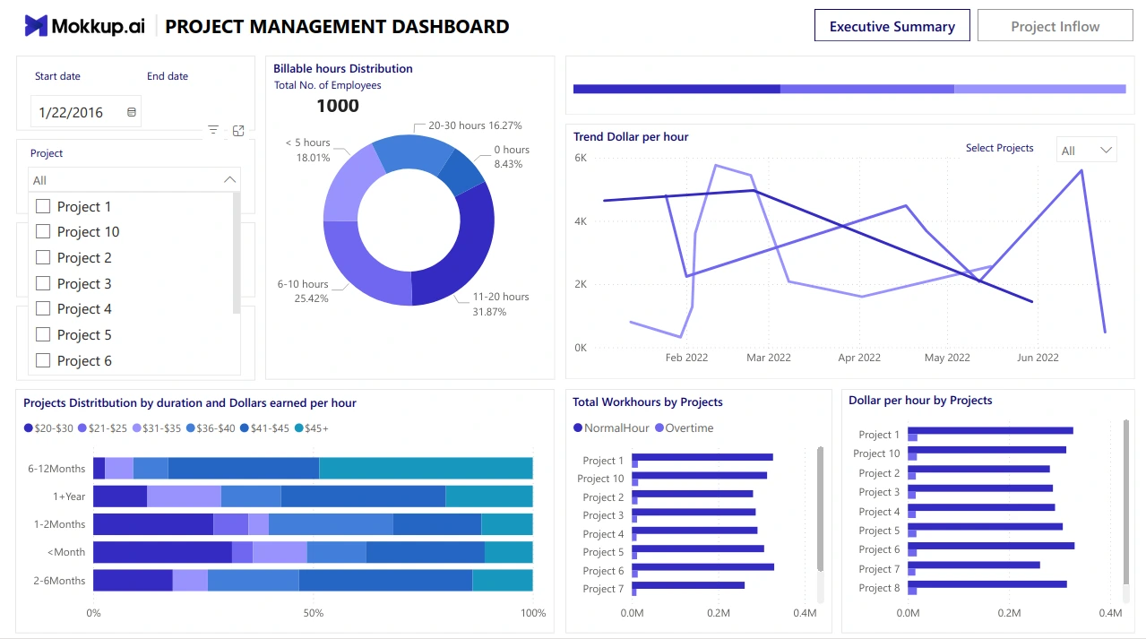
Project Management Dashboard
- It tracks information about work hours, projects, project distribution by duration and dollar earned.
- It used visualizations like doughnut charts, line charts, bar charts and 100% stacked bar charts along with filters to dive deeper into the insights.
- It allows tracking of project distribution and resource allocation, enabling better decision-making and management by providing an overview of key insights.
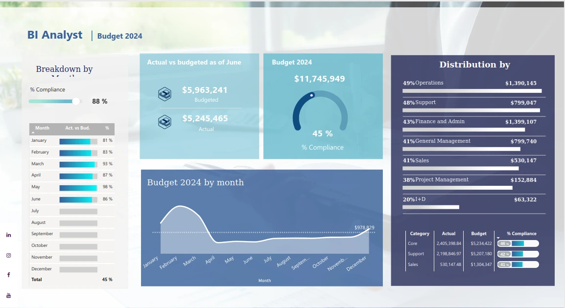
Budget Analysis Dashboard
- It tracks key metrics like budget distribution by departments, months, compliance and actual vs spent from budget.
- It uses visualization liks gauge chart, bar chart, and line chart to show the insights.
- It helps the stakeholders to keep a good track of the total budget and spent money and make better decisions to cut down on spending and plan the budget better.
stock market Dashboard
- It shows metrics like last close, current price, percentage increased or decreased and many other useful information.
- It features charts like, combination of line and column chart, box plot chart, and table, to get a clear clear picture of the current stock market share trend. It also has multiple filters to change stock and time period for better clarity.
- It is highly useful for analyzing current stock prices and tracking trends across different stocks and time periods. This helps users plan their investing strategy to optimize profits.
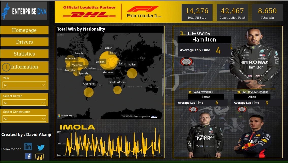
Sports Analysis Dashboard
- It shows metrics like total pit stops, construction points, and total wins for the sport “Formula 1 racing”.
- It used visualization like scatter map visualization and line charts. It also shows the top 3 performers and their average lap time. It also provides multiple filters for deeper analysis.
- It helps the team to analyse the performance of the sportsman and plan their strategy accordingly, it could also help to uncover some hidden trends and take action on it.
Also Read: Types of Plots: Visualization from Concept to Code
Conclusion
Power BI and other BI tools like Tableau help in pulling, processing, analyzing, and monitoring data for better decision-making. Dashboards provide real-time insights across various industries such as sales, marketing, HR, sports, and healthcare. These insights help decision-makers identify trends, areas for improvement, and take quick actions to optimize business performance.
Key Takeaways
- Dashboards enable data-driven decisions by revealing insights, tracking metrics, and uncovering trends to optimize business performance.
- Features like interactive charts, filters and slicers enable users to dive much deeper into the data and identify the trends.
- They are flexible as they can be used across different departments effectively.
Frequently Asked Questions
A. Data is the most crucial component as it forms the foundation for all insights and decision-making on the dashboard.
A. Design enhances user experience by making the dashboard visually appealing, easy to navigate, and ensuring that information is presented clearly and efficiently.
A. Interactivity allows users to explore the data by using filters and slicers, enabling them to uncover hidden trends and gain deeper insights.
A. Proper data processing ensures that the raw data is transformed into useful and meaningful insights that are accurate and relevant for decision-making.
A. Power BI dashboards are interactive visualizations that consolidate key data and metrics, helping users analyze and make data-driven decisions.
 NEWSLETTER


