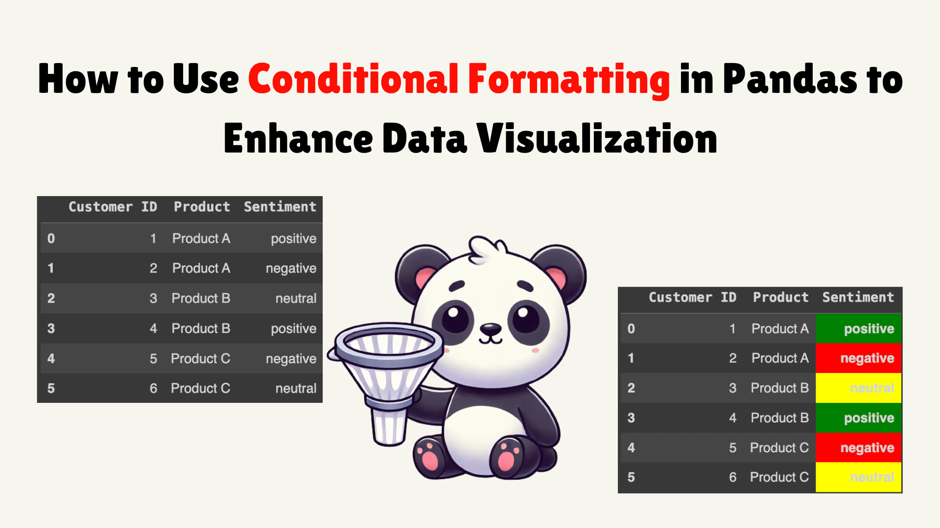
Image by the author | DALLE-3 and Canva
Although Pandas is primarily used for data manipulation and analysis, it can also provide basic data visualization capabilities. However, simple data frames can make information look cluttered and overwhelming. So what can you do to make it better? If you have worked with Excel before, you know that you can highlight important values with different colors, font styles, and so on. The idea of using these styles and colors is to communicate information in an effective way. You can do similar work with Pandas data frames as well, using conditional formatting and the Styler object.
In this article, we'll look at what conditional formatting is and how to use it to improve the readability of your data.
Conditional format
Conditional formatting is a Pandas feature that allows you to format cells based on certain criteria. Using this feature, you can easily highlight outliers, visualize trends, or emphasize important data points. The Pandas Styler object provides a convenient way to apply conditional formatting. Before we dive into the examples, let's quickly look at how the Styler object works.
What is the Styler object and how does it work?
You can control the visual representation of the data frame by using property. This property returns a Styler object, which is responsible for styling the dataframe. The Styler object allows you to manipulate the CSS properties of the dataframe to create a visually appealing and informative display. The generic syntax is as follows:
Where is the specific formatting function you want to apply, and are the parameters required by that function. The Styler object returns the formatted dataframe without changing the original one. There are two approaches to using conditional formatting with the Styler object:
- Built-in Styles: To apply quick formatting styles to your dataframe
- Custom Stylization: Create your own formatting rules for the Styler object and pass them through one of the following methods (
Styler.applymap:element by element orStyler.apply:by column/row/table)
Now, we'll cover some examples of both approaches to help you improve your data visualization.
Examples: Integrated Styles
Let's create a fictitious stock price dataset with columns for Date, Cost Price, Satisfaction Score, and Sales Amount to demonstrate the following examples:
import pandas as pd
import numpy as np

data = {'Date': ('2024-03-05', '2024-03-06', '2024-03-07', '2024-03-08', '2024-03-09', '2024-03-10'),
        'Cost Price': (100, 120, 110, 1500, 1600, 1550),
        'Satisfaction Score': (90, 80, 70, 95, 85, 75),
        'Sales Amount': (1000, 800, 1200, 900, 1100, None)}

df = pd.DataFrame(data)
df
Production:
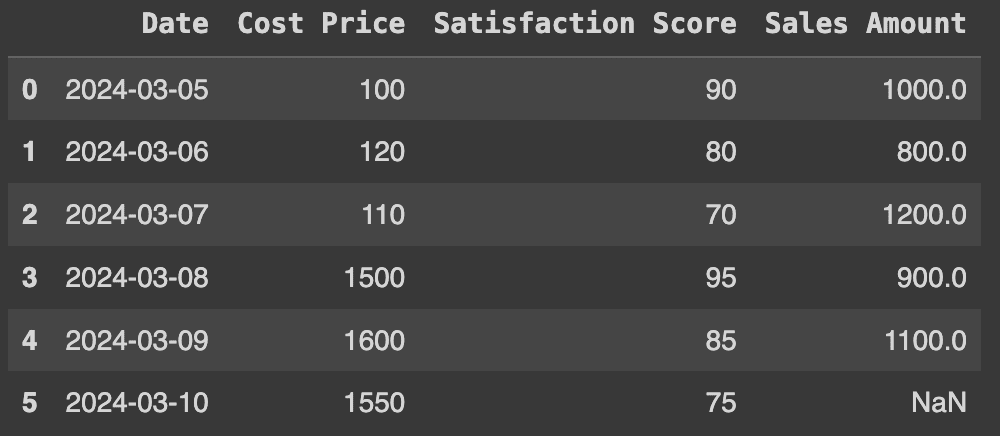

Original raw data frame
1. Highlight maximum and minimum values
We can use highlight_max and highlight_min Functions to highlight the maximum and minimum values of a column or row. For the column, set axis=0 as follows:
# Highlighting Maximum and Minimum Values
df.style.highlight_max(color="green", axis=0 , subset=('Cost Price', 'Satisfaction Score', 'Sales Amount')).highlight_min(color="red", axis=0 , subset=('Cost Price', 'Satisfaction Score', 'Sales Amount'))
Production:
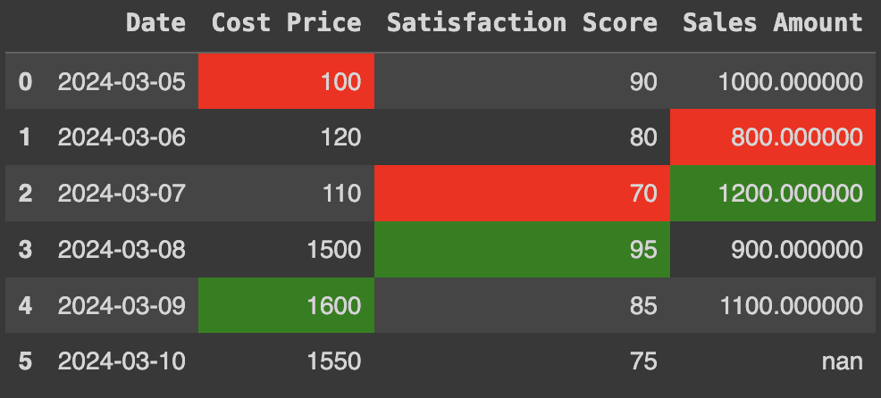

Maximum and minimum values
2. Applying color gradients
Color gradients are an effective way to visualize data values. In this case, we will apply the gradient to the satisfaction scores using the color map set to 'viridis'. This is a type of color code that goes from violet (low values) to yellow (high values). Here's how to do it:
# Applying Color Gradients
df.style.background_gradient(cmap='viridis', subset=('Satisfaction Score'))
Production:
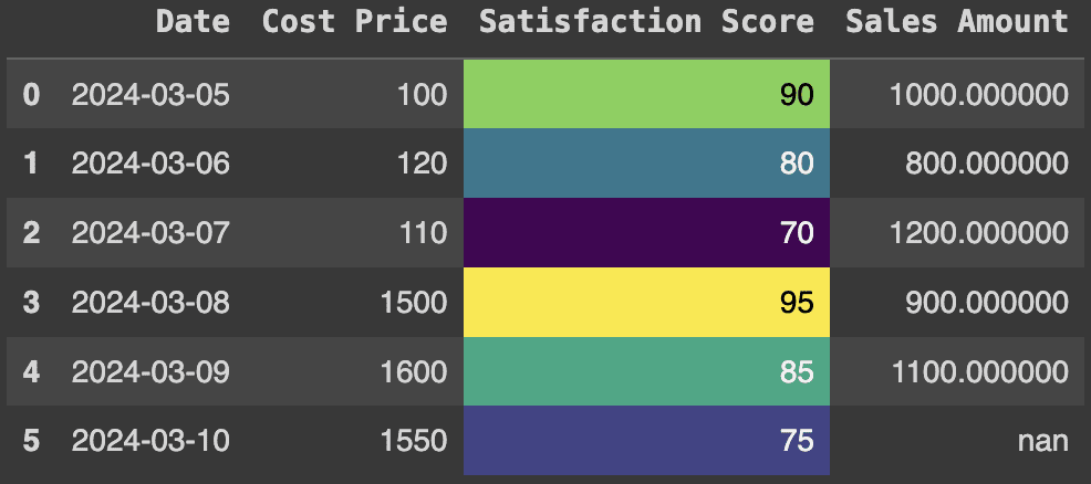

Color map - viridis
3. Highlight null or missing values
When we have large data sets, it becomes difficult to identify null or missing values. You can use conditional formatting with the built-in function df.style.highlight_null Function for this purpose. For example, in this case, the sales amount for the sixth entry is missing. You can highlight this information as follows:
# Highlighting Null or Missing Values
df.style.highlight_null('yellow', subset=('Sales Amount'))
Production:
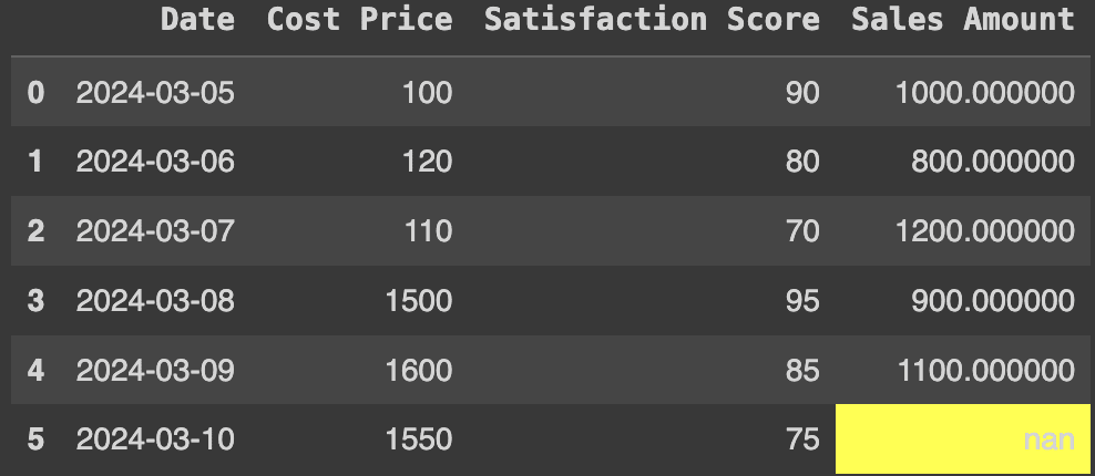

Highlight missing values
Examples: Custom styling using apply() & applymap()
1. Conditional formatting for outliers
Suppose we have a dataset of houses with their prices and we want to highlight houses with outlier prices (i.e. prices that are significantly higher or lower than those in other neighborhoods). This can be done as follows:
import pandas as pd
import numpy as np

# House prices dataset
df = pd.DataFrame({
   'Neighborhood': ('H1', 'H2', 'H3', 'H4', 'H5', 'H6', 'H7'),
   'Price': (50, 300, 360, 390, 420, 450, 1000),
})

# Calculate Q1 (25th percentile), Q3 (75th percentile) and Interquartile Range (IQR)
q1 = df('Price').quantile(0.25)
q3 = df('Price').quantile(0.75)
iqr = q3 - q1

# Bounds for outliers
lower_bound = q1 - 1.5 * iqr
upper_bound = q3 + 1.5 * iqr

# Custom function to highlight outliers
def highlight_outliers(val):
   if val < lower_bound or val > upper_bound:
      return 'background-color: yellow; font-weight: bold; color: black'
   else:
      return ''

df.style.applymap(highlight_outliers, subset=('Price'))
Production:
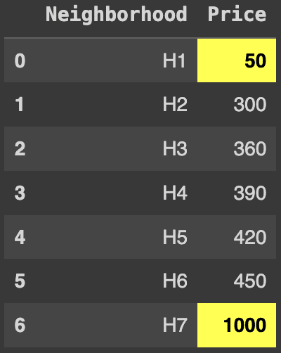

Highlighting outliers
2. Highlighting trends
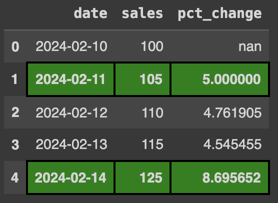
Imagine you run a business and record your sales on a daily basis. To analyze trends, you want to highlight the days when your daily sales increase by 5% or more. You can do this using a custom function and the apply method in Pandas. Here's how:
import pandas as pd

# Dataset of Company's Sales
data = {'date': ('2024-02-10', '2024-02-11', '2024-02-12', '2024-02-13', '2024-02-14'),
        'sales': (100, 105, 110, 115, 125)}

df = pd.DataFrame(data)

# Daily percentage change
df('pct_change') = df('sales').pct_change() * 100

# Highlight the day if sales increased by more than 5%
def highlight_trend(row):
    return ('background-color: green; border: 2px solid black; font-weight: bold' if row('pct_change') > 5 else '' for _ in row)

df.style.apply(highlight_trend, axis=1)
Production:
 5% increase in sales" class="aligncenter size-full wp-image-177346"/>
Highlight >5% increase in sales
3. Highlight correlated columns
Correlated columns are important because they show relationships between different variables. For example, if we have a dataset containing age, income, and spending habits and our analysis shows a high correlation (close to 1) between age and income, this suggests that older people generally have higher incomes. Highlighting correlated columns helps to visually identify these relationships. This approach becomes extremely useful as the dimensionality of the data increases. Let’s explore an example to better understand this concept:
import pandas as pd

# Dataset of people
data = {
    'age': (30, 35, 40, 45, 50),
    'income': (60000, 66000, 70000, 75000, 100000),
    'spending': (10000, 15000, 20000, 18000, 12000)
}

df = pd.DataFrame(data)

# Calculate the correlation matrix
corr_matrix = df.corr()

# Highlight highly correlated columns
def highlight_corr(val):
    if val != 1.0 and abs(val) > 0.5:   # Exclude self-correlation
        return 'background-color: blue; text-decoration: underline'
    else:
        return ''

corr_matrix.style.applymap(highlight_corr)
Production:
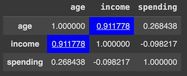

Correlated columns
Ending
These are just a few of the examples I showed as a starting point for improving your data visualization. You can apply similar techniques to several other problems to improve data visualization, such as highlighting duplicate rows, grouping into categories and selecting a different format for each category, or highlighting maximum values. Additionally, there are many other CSS options you can explore in official documentationYou can even define different properties when hovering over the text, such as enlarging it or changing the color. Check out the section "Fun things" for more cool ideas. This article is part of my Pandas series, so if you liked it, there's plenty more to explore. Visit my author page for more tips, tricks, and tutorials.
Kanwal Mehreen Kanwal is a machine learning engineer and technical writer with a deep passion for data science and the intersection of ai and medicine. She is the co-author of the e-book "Maximizing Productivity with ChatGPT"As a Google Generation Scholar 2022 for APAC, she champions diversity and academic excellence. She is also recognized as a Teradata Diversity in tech Scholar, Mitacs Globalink Research Scholar, and Harvard WeCode Scholar. Kanwal is an ardent advocate for change and founded FEMCodes to empower women in STEM fields.


